
Spry: Elevating a Natural Gum, Mint & Oral Care Brand with Research-Driven Strategy & Design
SPRY GUM | BRAND REVITALIZATION
Creating a wellness-driven, consumer friendly design system that promotes oral health through natural simplicity and refreshed packaging and branding.


Spry Brand & Packaging Redesign: Gum, Mints & Oral Care
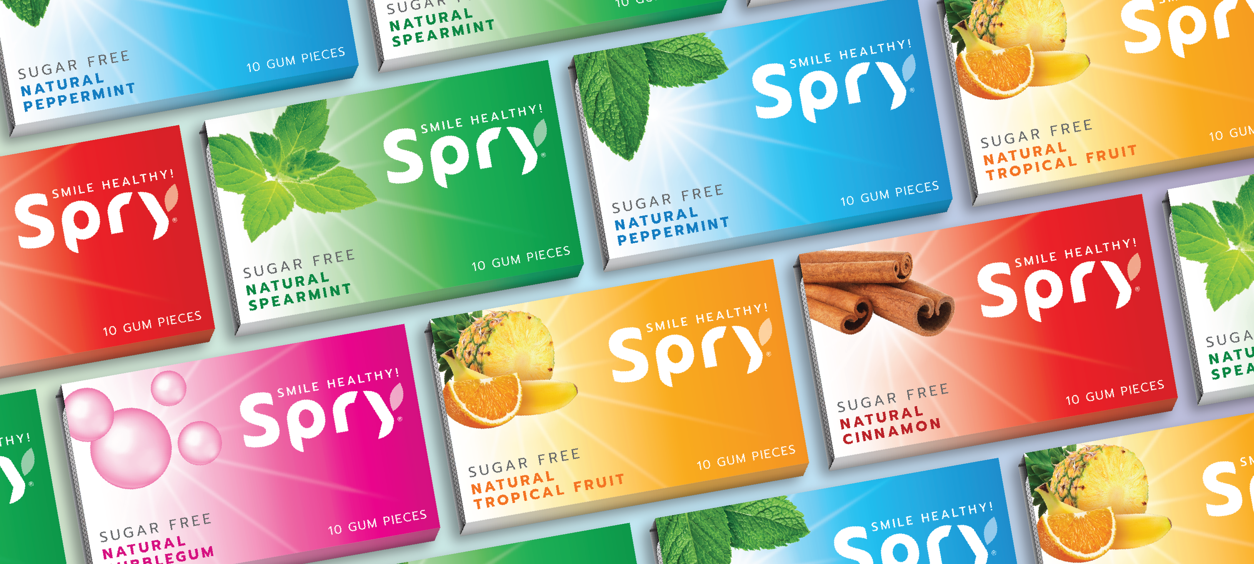
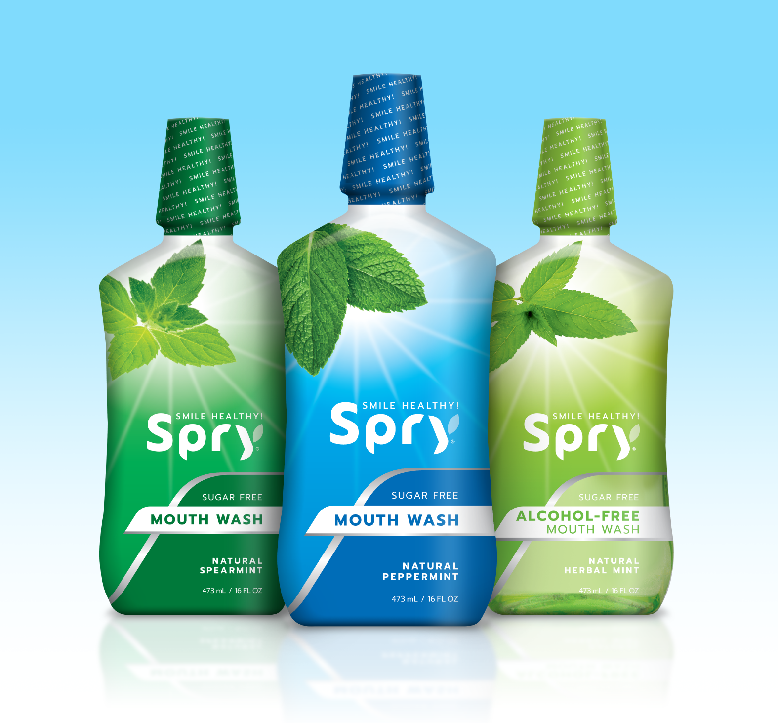
Spry, a leader in xylitol-based gum, mints, and natural oral care, partnered with CIULLA for a full brand refresh. The goal: modernize the identity, boost shelf impact, and appeal to both natural and mainstream consumers across sugar-free gum, mints, toothpaste, and mouth rinses. Spry needed a cohesive branding and packaging system that clearly communicated health benefits, taste, and trust.
Consumer Insights Drive Design
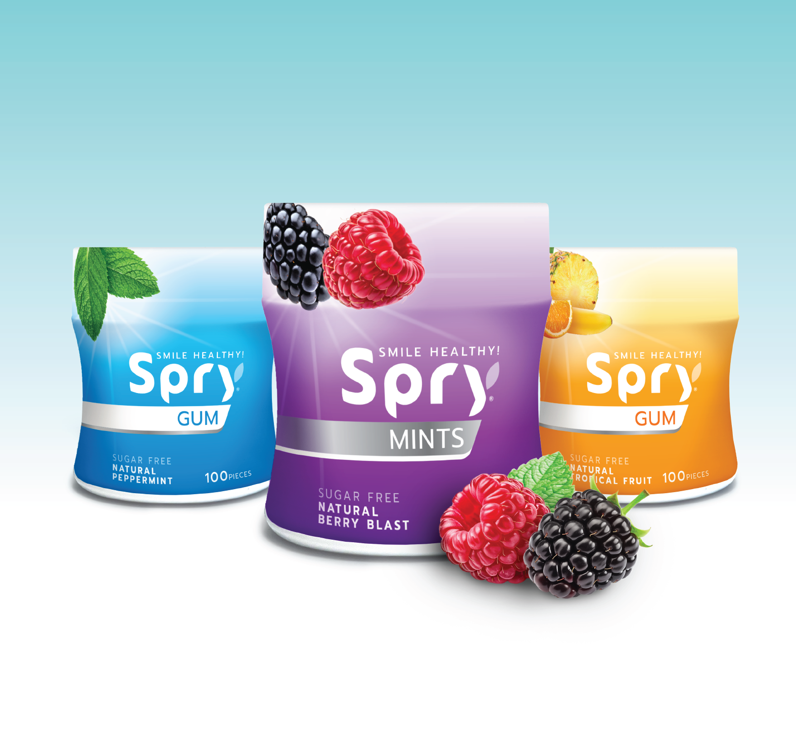
We began with qualitative research and focus groups to understand shopper behavior in gum, mints, and oral care. Key insight: xylitol is a differentiator, but most consumers didn’t know its benefits. By moving xylitol messaging to the back panel, we freed front-of-pack space for benefits that matter—Sugar Free, Anti-Cavity, Moisturizing—and highlighted fruit and mint flavor cues.
This insight shaped a clear visual hierarchy and messaging strategy across all product lines.
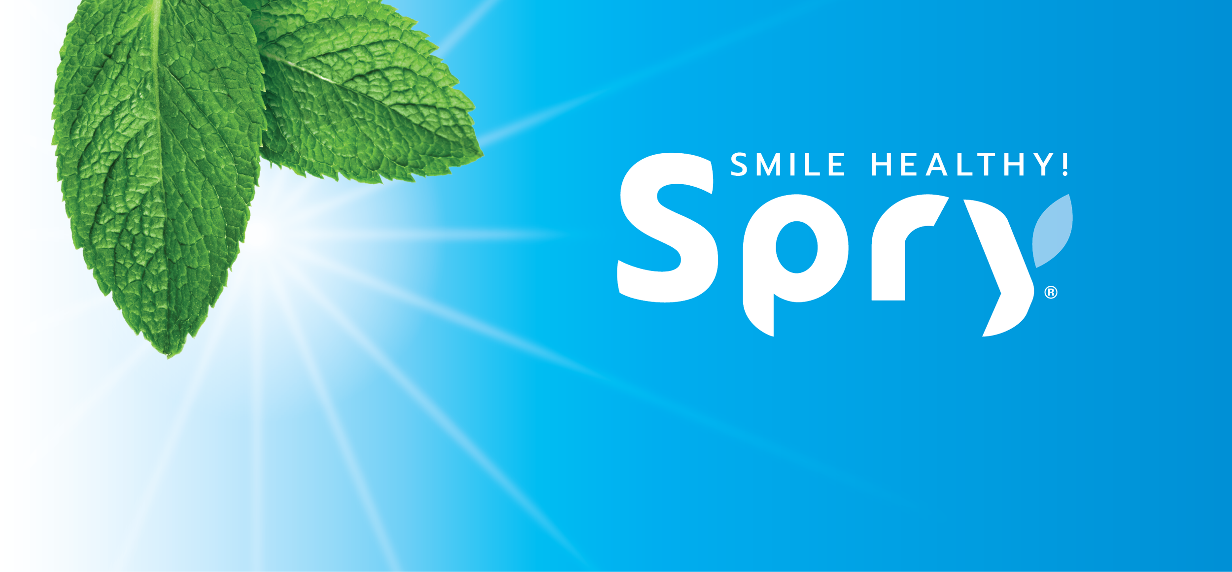
Modern, Fresh, Trustworthy Identity
The refreshed identity balances Spry’s natural, better-for-you origins with cues of dental credibility, taste, and freshness. A refined wordmark, the tagline “Smile Healthy”, a brighter color palette, and crisp typography convey simplicity, trust, and a sparkling-clean feeling. The system connects with both loyal natural shoppers and curious mainstream consumers.
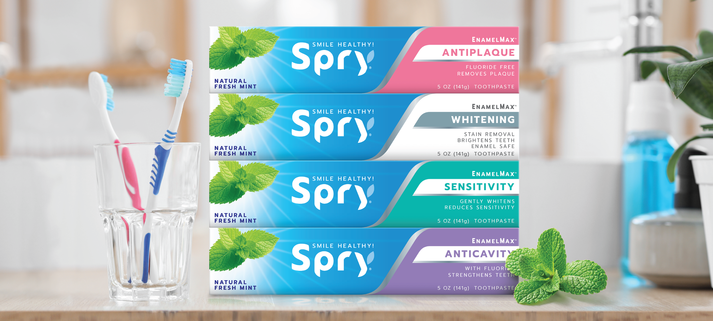
Unified Yet Flexible Packaging
Spry’s gum, mints, and oral care products each have unique usage occasions. Our flexible packaging system differentiates lines—bold, flavor-forward cues for gum; benefit-led messaging for oral care—while maintaining a cohesive brand presence. Each product feels part of the same family, yet expresses its own personality on shelf.
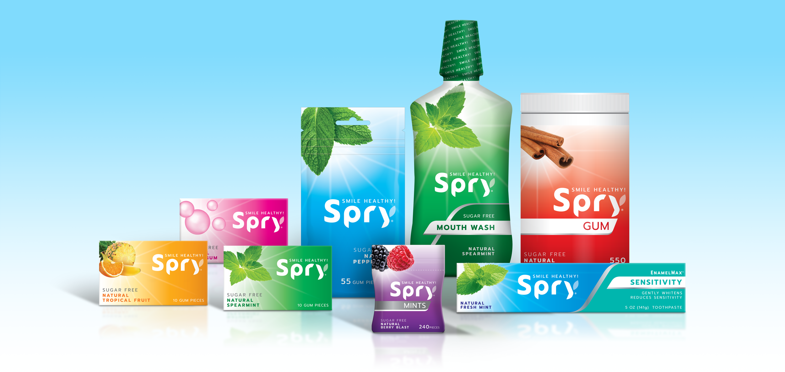
Scalable System for Multi-Category Growth
The new visual system supports expansion across categories and channels. Clear guidelines for color-coding, flavor communication, and claims hierarchy ensure every SKU delivers strong shelf impact and a quick, intuitive read. The system provides consistency while maintaining the bright, fresh, clean feeling central to Spry’s identity.
Results: Bright, Fresh, and Ready to Grow
The redesigned Spry brand now communicates Bright Freshness, Great Taste, and Sparkling Clean Feeling—core equities that appeal to both natural and mainstream shoppers. With a contemporary identity, clearer benefit messaging, and strong visual differentiation, Spry is positioned to stand out in gum, mints, and oral care aisles, driving stronger performance on shelf and online.